Sunday 31 May 2009

Lady town colour


Here is a development of the first piece 'lady town' which I am getting printed onto a t-shirt tomorrow.

robot leaflet.


Here is a mock up for the Recycle Robots leaflet. Simple, friendly and playful.

Tuesday 19 May 2009

Lady Town


This is another piece inspired by my weird little brother Louis. He didn't know where I went ever year when I moved into Manchester city center. He called it 'LADY TOWN' because he thinks that's where all the women go shopping and he hates shopping.

Sunday 17 May 2009

'Magpies Eat Birds'

My little brother can sometimes be a great influence on my work. His name is Louis Hammond and he is 7. He lives in a bizarre world where he is king and everything is strange. He recently told me that not magpies are not birds and in fact they eat birds. I have no idea where he got that from but i thought it was amazing. He has all these little words of wisdom and he is never wrong.
I am including these images in my Monsterboy project as I feel they would make great t-shirt designs.

Illustrated typefaces


These are a selection of hand drawn typefaces I have created recently. They are all different, they all represent different things. I have created these to support my ongoing illustrations for 'Monsterboy'. They are fun and have a hand drawn charm which is kind of what I am trying to express. I want them to represent me, my style of design.

Friday 15 May 2009

Design books


Graphic Design That Works

Templates

YCN 08/09

David Shrigley

The Adventures Anual (classic graphic stories)

Latin American Graphic Design

Protest T-shirts


Protest T-shirts is a book full of T-shirt designs created to provoke reaction. Many are a created to fight political and social issues. There are many aimed at the problems surrounding America and the involvement in the wars in Iraq, Iran, and Afganistan. There are also great examples of designs to fight consumerism and pollution.

'An anthology of graphic fiction, cartoons & true stories'


'An anthology of graphic fiction, cartoons & true stories'. I bought early this year to help me construct successful narratives. It was a visual influence to see the different style other artists and Illustrators have used to tell there stories. I particularly like the work of Robert Crumb, his dark and sometime provocative work is still so noticeable and distinctive. He displays a confident style, bold and heavy. Displayed in a block grid formation.

The Mighty Book of Boosh


I purchased 'The Mighty Book of Boosh' early this year. It was so inspiring, making me obsessed with illustrating my own ideas, stories and characters. It is a jumble of work the Mighty Boosh team have worked on since they began. It is a great publication full of ideas and is a stunning example of alternative self promotion.

Hand Job


Hand Job, I purchased recently to support my typeface project. It is an inspiring catalog of hand drawn type. There are some beautiful typefaces, some practical and usable and others purely decorative, pieces of illustration. The book has inspired the creation of many typefaces of my own. It is worth a look.

Thursday 14 May 2009

Robot A5 to A1 poster


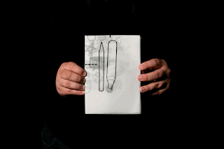
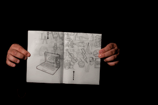
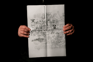
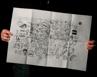
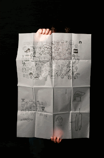
I wanted to make something more interactive for people to have and desirable to keep. I have tried to tell a simple narrative of how the robots were created. Starting with the pens, next the Mac the the robot parts etc......

Monsterboy A5 to A1 poster


I have been looking at different way to format my designs. I have created an A5 document which pulls out to become an A1 poster. I printed onto tracing paper which I later found to be very difficult to fold and manipulate. It is stiff and less flexible than paper which means it is getting damaged on the folds.

Sunday 10 May 2009

Lucy Vigrass


Lucy Vigrass is another member of the 'Peepshow Collective' who's work I admire greatly. She is a freelance illustrator working in London. Her work is beautifully bold and shows a minimal amount of detail. Working with shape and colour to communicate her ideas, creating stunning compositions with a her signature style. I have been looking through the work from the Peepshow recently and as this is the sort of group I would love to be apart of when I leave university. Check out www.lucyvigrass.co.uk and www.peepshow.org.uk for more work.

Alex Ostrowski talked to us


On Friday we had the privilege of having a talk from Alex Ostrowiski. A young designer doing exactly what we all would love to be doing. He gave some crucial advice as someone who has been approaching people for work and making contacts in the design industry. He mentioned how it is important to build a rapport, a conversation rather than a request for a job or a placement. Other than his advice on getting work when we leave he showed us a collection of his work which has got him where he is now. A mix of fantastic ideas and well executed design solutions. The 'NOTE TO SELF' book was a great piece of work. It was designed to fulfill a competition brief which insisted it was to be A3 size and have only 16 pages. He created a book of reminders, beautifully illustrated little messages to inspire. He is currently working for YCN doing some great work which I hope to one day be doing.

Was a great time to have the talk from Alex and will definitely put us in a good frame of mind on the run-in to the end of our time at uni.

Friday 8 May 2009

paper faces 'what you saying bruv...?'

paper faces stop motion from sam on Vimeo.


Stop motion piece just for fun. Practice before the robots piece.

robot stop motion.

robots recycle stop motion from sam on Vimeo.


This is a stop motion piece I created for my recycling project. It is rough, flawed and needs refining but the idea is clear enough. Hope you like it.

Thursday 7 May 2009

Home Delivery ASOS.


I am currently working on a competition brief for 'asos' the online clothes company. The brief is to make men aware of the company and its attributes and make them interested in using the website. I have tried to connect the brand to men by creating neon signs with the type as seen in takeaways. Home delivery, piping hot brands, fresh styles etc. I think it would appeal to men. I am struggling to create a neon sign look I am happy with.

Wednesday 6 May 2009

Books, lots of books.


I have been looking at different book making techniques over the last week or so. I want to see if a small book would be a successful canvas for my illustration and narratives. I worked with Lucy Schofield on Friday who really got me interested in all things books. Here are three I created. The first is a small flip book cropped and bound with two screw bolts. The second is a slightly larger flip book bound with string and the third is a simple stapled book. I looked into what would be applicable for sending out to people, thinking about cost, size and functionality.

Saturday 2 May 2009

Non-format design


I have been aware of Non-format for a while and thought I would share them with you. They are a creative team consisting of Kjell Ekhorn (Norwegian) and Jon Forss (British). Based in London and Minneapolis (USA). They are an inredibally creative design team with clients across the world, including Nike, LG, The New York Times, Channel 4 etc.
In a recent lecture from all round creative guru Adrian Shaughnessy mentioned how he worked with them on the design publication 'Varoom'. They show and amazing creative flair with type design seen on the work they have done for Nike. I have chose to look at them now as I am in need of some direction and inspiration with a advertising project I am working on. The simple choices they have made are probably the most effective. The choice of colour and type are important.