Friday 27 March 2009

Glamorous Hooligan


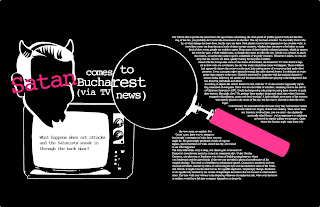
This was created as a t-shirt print for upcoming brand. The work was never sent as communications broke down but still created a nice piece of type to show all. The brand had a play on words, mixing the two contrasting description to create an idea of what there brand is to represent. I wanted to created a jumbled piece to show a controlled chaos.

down at the bottom of the garden


I want explore a range of interesting titles from my childhood, from TV shows to nursery rhymes. I will be creating a set of typographic pieces trying to reflect what they mean to me. When I was a child i liked the 'Podington Peas' title sequence where this comes from. "Down at the bottom of the garden......." I love the use of letterpress as you are able to create imperfections which make results interesting. This is simply a quick experiment to show you some of my ideas for the project.

Wednesday 25 March 2009

Essay Proposal Stussy


For my third year dissertation I was asked to create 2 x A3 pieces as a visual proposal for my intentions with the essay. I have a huge interest in Urban Fashion brands such as Stussy and came up with these two pieces which are simply photographs of my thought process as I was researching for the essay. I liked my outcome it was so different to anything else created by others in my class.

Surfers for simon


These are hand drawn illustrations a created for a friend who is creating a moving image piece based on surfing. I was interested in working with Simon after seeing some of his previous projects and thought my style of illustration may compliment his ideas. The project is still on going and with more work needed on the illustrations.

Good times bad times


I love to explore type as image. This logo was a quick exploration just to see what I could do with the words to visualize the message.

Lets build a robot


This is a print design to interest children and parents in the importance of recycling. I especially like the wooden robot illustration.

Robot Type


This is a piece of type made from the components that the robot characters are made. 

Pig Ink


Pig Ink is a hand drawn design which was inspired by an article I read about artist Wim Delvoye who tattooed pigs and when they died he exhibited their skins. I thought the idea was hilarious and creative. 

Monsterboy


'Monsterboy' is an urban fashion brand I designed last year. I hope to print a selection of t-shirts in the near future. The brand is a fun, urban brand with a focus on bold t-shirt prints that reflect my personal interests and imagination.

Tuesday 24 March 2009

Satan comes to Bucharest


This is a magazine layout I created for a University project for John Walsh's Flux magazine.

Robots


This is a selection of robot characters I have created as part of a recycling campaign for children. They are hand drawn and edited in Illustrator.

Manchester letterpress


This is a piece of letterpress I created a while ago but like it enough to show you all. I simply wanted to create an interesting piece of type to reflect my hometown of Manchester.

Faces of death illustration


This is a piece i created for a friend who is putting together a illustration magazine. The brief was simply death and I chose to look at the faces of death, who is responsible. I want to take this idea further after taking some helpful advice.

Eddie Izzard Pulp


This is a line drawing using fine liner for an article for Pulp magazine, the MMU student magazine. I was asked by Matt and Oyunga to create a simple profile image of the actor/comedian to visualize the interview.