Showing posts with label typography. Show all posts

Thursday, 20 August 2009

Life is what you make it


Another t-shirt design I created for the Ringspun brief. I took the 'Life is beautiful' theme and used a commonly used phrase 'Life is what you make it'. The mostly white design is a hand drawn design and the other has been worked on using Illustrator to give it a dynamic style to create a feeling of movement.

Placement at Ringspun. Life is Beautiful.


I recently applied for a 6 month placement with Redinc Design who design Ringspun clothing. I had an interview which went well and was asked to complete a short brief to see if I could understand the brands style. The brief was to create 1) a brand carrier t-shirt based on the theme of 'Life Is Beautiful'. 2) a t-shirt based on the theme of 'Indigenous Warriors'. 3) a pair of denim jeans which have unique qualities.

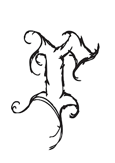
This is a hand drawn logo for Ringspun. The typeface was designed to have a classic style, but have a contemporary gradient fill.

Sunday, 17 May 2009

Illustrated typefaces


These are a selection of hand drawn typefaces I have created recently. They are all different, they all represent different things. I have created these to support my ongoing illustrations for 'Monsterboy'. They are fun and have a hand drawn charm which is kind of what I am trying to express. I want them to represent me, my style of design.

Thursday, 7 May 2009

Home Delivery ASOS.


I am currently working on a competition brief for 'asos' the online clothes company. The brief is to make men aware of the company and its attributes and make them interested in using the website. I have tried to connect the brand to men by creating neon signs with the type as seen in takeaways. Home delivery, piping hot brands, fresh styles etc. I think it would appeal to men. I am struggling to create a neon sign look I am happy with.

Thursday, 16 April 2009

Hand drawn type


I constantly practice creating my own typefaces both digitally and by hand. These are a selection of bold hand drawn typefaces. I wanted them to be quite sketchy to show a more human voice. They are going to be used in upcoming designs for my 'Monsterboy' project. 

Hey diddle diddle...


I wanted to create some hand drawn type to illustrate the nursery rhyme. I was influenced by the work of Andrew Rae and Luke Best of the Peepshow Collective. I kept the piece two colour to keep it simple and clear. It flows down the page as you read it. A full colour piece would be too busy and distracting. Let me know what you think.

Wednesday, 1 April 2009

Type using shapes


This began as a support project to create a typeface to work with my recycling project. It soon escalated as i discovered an obsession with creating typefaces and finding faults and correcting them. I wanted to see if I could create a typeface which was graphically interesting with only the basic regard for legibility. I enjoyed this small project enough to expand it into a full project to create my own typefaces. The project has given me a chance to understand the discipline it takes to create a successful typeface. In the images there are two which are built from digital shape and one which similarly built from shapes but hand drawn shapes to give the typeface a human element.

Friday, 27 March 2009

Glamorous Hooligan


This was created as a t-shirt print for upcoming brand. The work was never sent as communications broke down but still created a nice piece of type to show all. The brand had a play on words, mixing the two contrasting description to create an idea of what there brand is to represent. I wanted to created a jumbled piece to show a controlled chaos.

down at the bottom of the garden


I want explore a range of interesting titles from my childhood, from TV shows to nursery rhymes. I will be creating a set of typographic pieces trying to reflect what they mean to me. When I was a child i liked the 'Podington Peas' title sequence where this comes from. "Down at the bottom of the garden......." I love the use of letterpress as you are able to create imperfections which make results interesting. This is simply a quick experiment to show you some of my ideas for the project.

Wednesday, 25 March 2009

Good times bad times


I love to explore type as image. This logo was a quick exploration just to see what I could do with the words to visualize the message.

Robot Type


This is a piece of type made from the components that the robot characters are made. 

Tuesday, 24 March 2009

Manchester letterpress


This is a piece of letterpress I created a while ago but like it enough to show you all. I simply wanted to create an interesting piece of type to reflect my hometown of Manchester.