Thursday 20 August 2009
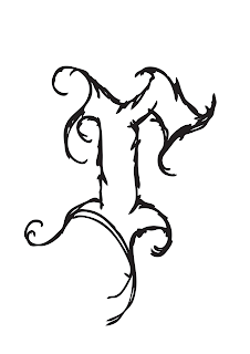
Brand carrier t-shirt.
'Life is what you make it' t-shirt design. A single line flowing to create a script style piece of type. I like the strokes used, showing the imperfections. I could imagine this design working well as a screen printed piece.
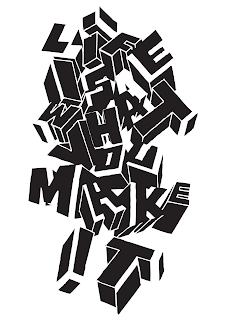
Life is what you make it
Another t-shirt design I created for the Ringspun brief. I took the 'Life is beautiful' theme and used a commonly used phrase 'Life is what you make it'. The mostly white design is a hand drawn design and the other has been worked on using Illustrator to give it a dynamic style to create a feeling of movement.
Placement at Ringspun. Life is Beautiful.
I recently applied for a 6 month placement with Redinc Design who design Ringspun clothing. I had an interview which went well and was asked to complete a short brief to see if I could understand the brands style. The brief was to create 1) a brand carrier t-shirt based on the theme of 'Life Is Beautiful'. 2) a t-shirt based on the theme of 'Indigenous Warriors'. 3) a pair of denim jeans which have unique qualities.
This is a hand drawn logo for Ringspun. The typeface was designed to have a classic style, but have a contemporary gradient fill.
Wednesday 22 July 2009
Guess who?
Hello....
I have been a bit quiet of late... so thought it was about time Finished University and had an amazing Degree Show. I have been working on a few small projects to keep the creative juices flowing.
I have been busy searching and hunting for placements and opportunities to keep developing my design skills. All will follow shortly.
Saturday 20 June 2009
D&AD Degree Show Bar Illustration
I was asked a few weeks ago if I would like to do something for the bar area of our end of year degree show. I was told to do some illustrations, anything. This was very open so I thought it would be appropriate to have birds flying. To represent us leaving Uni and going into the industry. I added the line 'SPREAD YOU WINGS AND EAT WORMS'. I asked a friend and all-round creative Tom Blackett to work on the one-day project, asking him to take control of the type. His love for type and my passion for drawing created a great piece of work which got a huge amount of attention.
Tuesday 16 June 2009
More faces of death
Subscribe to:
Posts (Atom)